i
A typeface cannot teach a hand
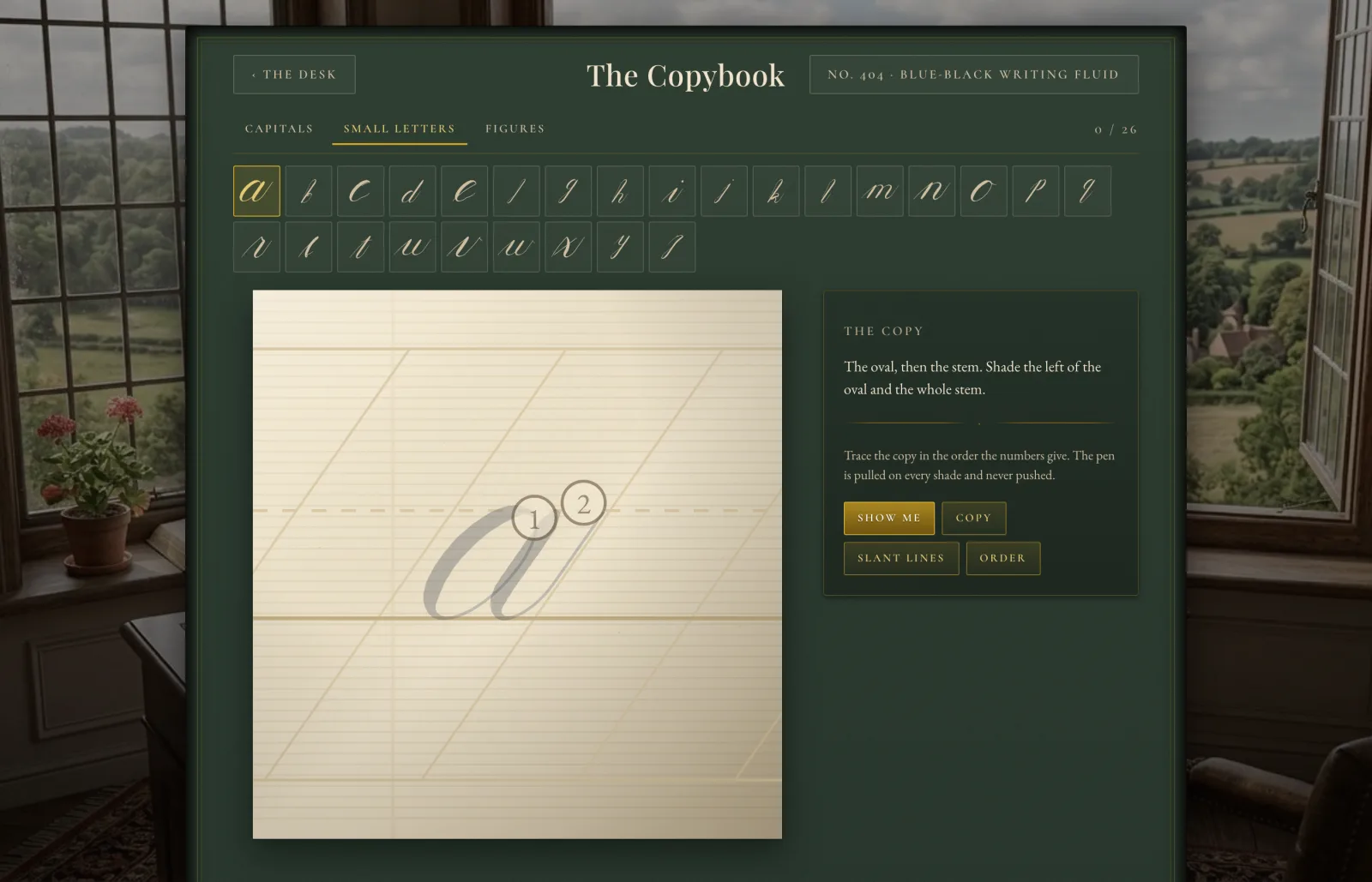
A font is a filled shape. It cannot tell you the stroke order or the
direction of travel, and those are the two things a penmanship app is
actually teaching. So the alphabet here is a construction kit — entry,
stem, over-turn, under-turn, oval, ascending and descending loop — and
the letters are built out of it.
ii
Authored upright, sheared to 55°
A vertical stem becomes a slanted stem and an ellipse becomes the
slanted oval, one transform applied once. Change a proportion and the
whole alphabet moves together, which is exactly what a copybook means
by a hand.
iii
Weight is derived, never stored
A pointed nib spreads when it is pulled and closes when it is pushed —
that is why copperplate shades fall on the downstrokes. Every
tangent is measured against the slant and the width worked out from it.
The exemplar and your own hand go through the same function, so they
cannot drift apart.
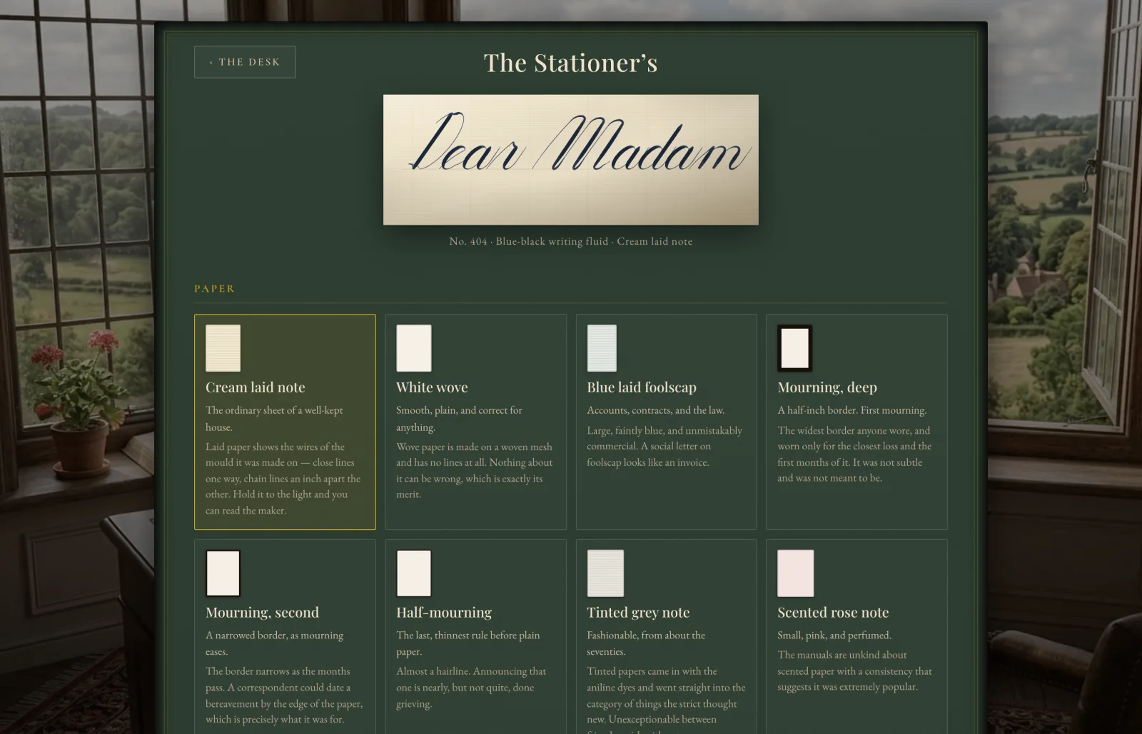
And the colour follows the weight: thin ink is genuinely paler than
thick, being the same pigment in a thinner film. The ribbon is banded by
film depth rather than washed with a gradient, because weight varies
along a curve and a gradient runs in one fixed direction.